
In 1992, the New York Knicks were ready for a new era—and they needed a visual identity that matched the energy of a team representing one of the world’s most iconic cities. To lead the transformation, NBA Creative Director Tom O’Grady turned to celebrated designer Michael Doret, whose bold lettering style and geometric instincts made him the perfect choice for the job.
What followed was the creation of one of the most enduring logos in NBA history.
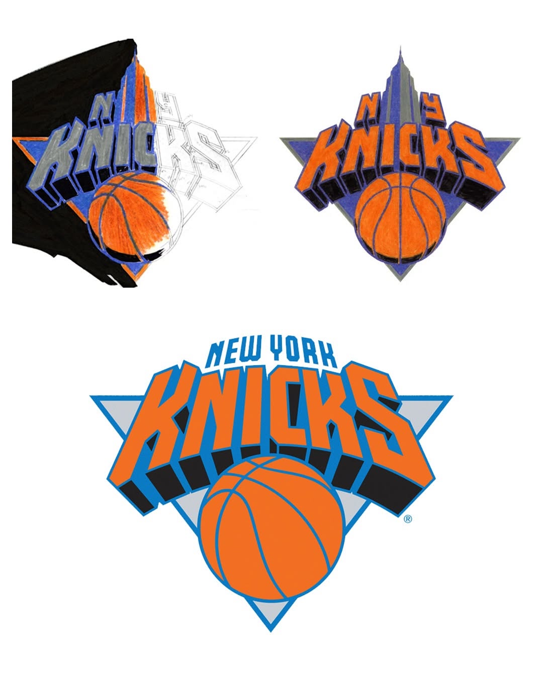
The Early Sketches: New York at the Center
When Doret began the redesign, the NBA specifically asked him to explore a visual nod to New York City. In the earliest concepts, Doret experimented with integrating the Empire State Building, one of the city's most recognizable landmarks. These sketches explored how the towering silhouette could blend with the Knicks' identity—strong, ambitious, and unmistakably New York.
But while the building was a striking idea, it never moved past the rough draft stage.
Why the Empire State Building Was Removed
As the process evolved, Doret and the creative team realized the landmark-related concepts weren't the direction the Knicks needed. The Empire State Building ultimately faded out for several creative reasons:
Too literal: The reference felt more like tourism branding than a timeless team emblem.
Visually crowded: The tall building clashed with the composition, making the logo feel overloaded.
Lacked longevity: The design didn’t carry the clean, lasting quality required for a franchise identity.
The Knicks needed a symbol that felt strong, modern, and flexible—not a design tied down by heavy detail.
The Breakthrough: Geometry, Balance, and Bold Lettering
Once the landmark concept was eliminated, the direction became clear. Doret leaned into what he did best: precision geometry, bold shapes, and powerful typography.
He refined the layout, sharpened the forms, and began hand-lettering what would become the signature “KNICKS” wordmark. The angled, athletic typography sat perfectly over a sleek triangle, with the classic basketball form grounding the entire composition.
The result was a design that felt
Dynamic without being busy
Modern without feeling trendy
New York without using literal landmarks
It was a masterclass in creating identity through energy, not illustration.
A Logo Built to Last
The final logo debuted for the 1992–1993 NBA season, marking the beginning of what would become the Knicks’ longest-standing identity. While the emblem has received subtle refinements over the years, Michael Doret’s core design remains almost entirely intact more than three decades later.
Few NBA logos have enjoyed that level of longevity—a testament to Doret’s craft, vision, and understanding of what truly lasts.
The Legacy of the 1992 Knicks Identity
Today, the Knicks logo is considered one of the defining marks of NBA design history. It remains instantly recognizable, tied to unforgettable eras of New York basketball—from the Patrick Ewing days to the resurgence of Madison Square Garden’s modern stars.
Its endurance proves a simple truth:
Icons aren’t created by accident. They’re built through sketchbooks, refinement, and an instinct for timeless design.
And in 1992, Michael Doret delivered exactly that.